

UX/UI Design
WhatsApp redesign
Problem
After much research and observation of the existing WhatsApp, we noticed a few main points to focus on and change in order to better improve the app. The overall design is completely dated and feels as though it has been untouched since the app was created. Also, there are several features that were unclear while using. The signup process involved connectivity options that actually weren’t optional, this made it difficult for users to skip through these if they choose to not wish to sign up a certain way. Another feature that WhatsApp has is called “My Status.” This is similar to stories on Instagram and other social media outlets. As a team, we felt this feature was unnecessary and overdone. The final problem we ran into was the settings menu, verbiage and other menu items were labeled poorly resulting in confusion and misleading end results.
Solution
Our goal was the address all the problems we observed. The objective was to create an interface that is minimal but also user-friendly and allows the user to easily message, call, preform a few tasks such as sending money and pictures, as well as customize their chat experience with no confusion.

Brainstorming
To start our brainstorming process we first started by making assumptions about WhatsApp and other messaging apps as well. We did this to get in the mindset of an individual who would use this app daily and to try to understand what they would actually use versus what they may not. From there, we continued forward by conducting contextual research to either prove or disprove the assumptions that were made. We really took the time to learn and immerse ourselves into what a daily user would want out of an app such as WhatsApp. Katelyn had never used WhatsApp before and Sarah has only a few times. We really took it upon ourselves to explore deeper into what the overall app can offer a single user.
Research
In order to gain more knowledge and understanding for what is expected of most messaging apps, we created a survey using Google Forms, conducted interviews, created user-journey maps, researched competitors, and created multiple scenarios.

What we found
As a team, we reached out to our colleagues, families, and freinds with a Google Forms survey in attempt to better understand more about WhatsApp. We ultimately wanted to know who uses it, what the age groups are, what is most commonly used within the app, and when individuals typically use it. What we found was really beneficial in understanding how the average WhatsApp user uses their app. We learned that not many people use the feature known as “My Status,” or even knew about it. We originally assumed that most users were aware of this feature but this turned out to be false. We had also assumed that most of the WhatsApp users also used other social media platforms, specifically Facebook. What we also found was that most users really enjoy the customization features, as most other messaging apps do not allow this.

Interviews
As we further researched WhatsApp, we felt as though the survey wasn’t enough to move forward with our process. Katelyn interviewed some of her friends in a setting where she brings up the usage of WhatsApp in casual conversation. Through this passive observation, Katelyn asked how her friend and her friends husband were going to stay in contact while he was away in a foreign country. Katelyn's friend mentioned “I have heard good things about WhatsApp so my husband downloaded it to our phones so we can talk overseas.” It was also stated by the friend, “I really like how you can customize the background of your message page.” We took this information and decided that it is incredibly important to be able to keep that customization feature but make it way easier to access.
Competitor Research

User Journey Map
As a team we went through the Journey Mapping process with Katelyn as our main persona. She is someone who has never used the application before so we were able to pinpoint pain areas and other issues in order to better the application.

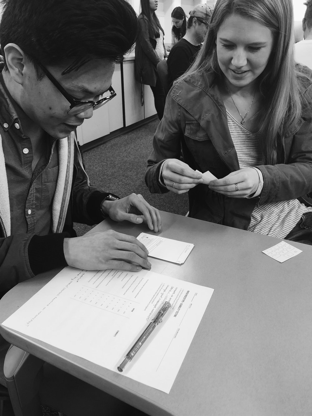
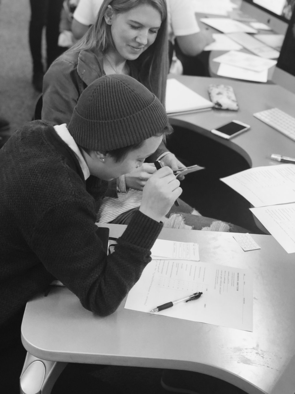
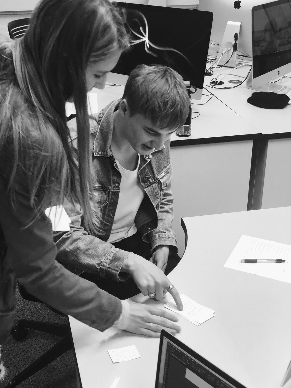
User testing
It took quite a few trial and errors during our user testing experience, but we did end up finding a solid interface system that would then become WhatsApp’s new update. Our first user experience was very beneficial. We learned that the verbiage of several menu items were confusing to some users. We also found a few dead ends that we eventually needed to fix as a team. When we did the second round of user testing with InVision, we found that a lot of the changes and updates we made were incredibly successful and every single user, during the test, was able to accomplish each task at hand.

Concept
We created a word list for the overall concept and interface of our app. Some of the words included were SIMPLICITY, CONVERSATION, and CIRCULATION. We took these words and brought them to life. The current interface is slightly dated, and isn’t as clean as it could be. We also wanted to integrate the message bubble logo a little more as this is not something that is currently being done. The current colors don’t quite go and seemed to be a little off, so we also took time to reconfigure a color pallet for the entire interface. In order to make the app look more up to date, we did research on current trends in UX design and we found that gradients are very current. We used gradients quite a bit in the sign up process as well as for the call screen. Simple, clean and white backgrounds are also very current and extremely popular for UX design right now as well so we integrated this in our messages and settings pages. During our research process, we found that the menu bar at the bottom of the current application was unecessary and could be easily solved with creating a simple menu button at the top. We also found during our research that the majority of people that use WhatsApp do not use the status updates feature, so we removed this completely.
Final Product

Here is a video showing our new WhatsApp interface.
This project was done in collaboration with Sarah Dumas
Responsibilities:
Katelyn Luque: Contextual Research, Goals, Statement, Assumptions, Surveying, Interviews, Brand Concept, User Flow, Paper Prototype, Initial Design, User Testing, Pitch Presentation, Image Mockups
Sarah Dumas: Contextual Research, Goals, Statement, Assumptions, Surveying, Brand Concept, Sketches, Low-Fidelity Wireframes, Hi-Fidelity Wireframes, InVision Mockup, Design Refinements, User Testing, Case Study, Image Mockups